Warhammer 40,000 Map Icons v6.0

Being the tragic geek that I am, I spent several months last year coding up an interactive map of the Warhammer 40,000 galaxy. What I came up with worked beautifully in Firefox on my fairly grunty, fairly new computer, but like an absolute dog with any other setup, so I’ve had no choice but to go back and start over from scratch – a prospect so disheartening that it will be many, many months before I can bring myself to look at it again, if ever.

The upside of this failed project however is that I ended up doing a complete revision of my Warhammer 40,000 map icons. And when I say complete revision I mean a radical change in the way they’re organised. So radical in fact that I’ve decided to leave version 5.0 available in this post for those who might prefer them, while making the new version available here.

The major changes in version 6.0 include…

Separation of Environment, Class and Affiliation: There are now separate sets of icons for the environment of a planet, how it’s categorised by the Imperium (ie: what ‘Class’ it is), and who controls it.

Consistent Colours: Each major faction now has a consistent colour scheme rather than the previous hodge-podge, so it’s easier to see who controls what at a glance.

Consistent Shapes: The sizes and shapes of icons are standardised rather than being all over the place with bits sticking out the sides.

Meaningful Shapes: Five different icons shapes are provided to represent planets/moons, space stations, dwarf planets/asteroids, fields/swarms and fleets/ships.

I’ve also added sub-faction specific icons so you can differentiate between (for example) Biel-Tan Eldar and Iyanden Eldar, or Mephrit Necrons and Sekemtar Necrons, should that be your idea of a morally acceptable good time.

I present the icons here in three formats

SVG Version  This is the version to use if you know what you’re doing with Vector graphics. If you’re making your map in a vector editor such as Illustrator or Inkscape this is the superior option. If you’re not, then one of the PNG versions will probably be more convenient.
DOWNLOAD

White PNG – An export of the Icons on a flat white background.
DOWNLOAD

Black PNG – An export of the Icons on a flat black background with a white glow effect.
DOWNLOAD

I should probably add a transparent PNG version, shouldn’t I? Maybe tonight…

Anyway, share and enjoy!

Severn Horror

Severn Horror – my homemade expansion for Arkham Horror 2nd Edition based on the works of Ramsey Campbell – is done.

After three solid days of documenting, revising, documenting, revising and documenting again I am too mentally shattered to write anything witty or interesting, so I’ll just blurt the finished product onto the net and worry about promoting it later.

Version 1.1 Rules (232 kb PDF File)
Severn Horror v1.1 (228 Mb Zip File)

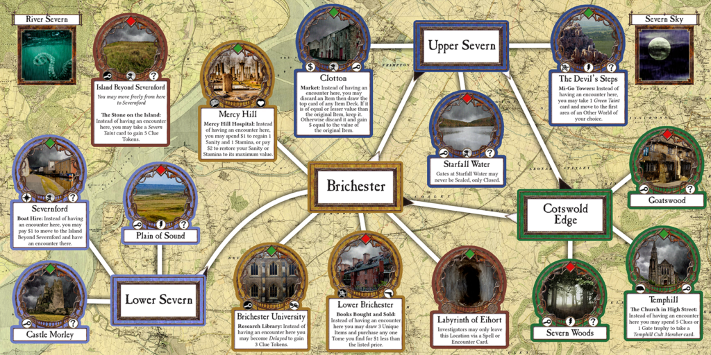
Here’s a preview of the final Board

Welcome to Brichester. Mind the Brood.

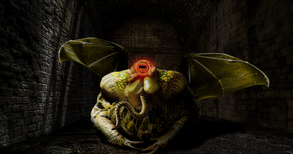
And here’s my illustration of Byatis, which Ramsey Campbell himself (!!!) described as “splendid”

Byatis AKA Serpent Bearded Byatis AKA the God of Forgetfulness AKA the Berkeley Toad AKA Gary

Enjoy! And don’t bother me for the next week! ;D

Warhammer 40,000 Map Icons

UPDATE! Version 6.0 of the icon set is now available, but it’s a radical departure from previous versions, so I’m leaving version 5.0 here for those who might prefer the old style. Version 6.0

Many years ago I purchased the rulebook for the now sadly defuct Fantasy Flight Warhammer 40k RPG Dark Heresy. While I thought the game was great I was rather annoyed by the poor quality of the planet icons used in the provided map of the Calixis Sector, and being the kind of obsessive nerd I am I couldn’t help but make my own version of if where you could tell what planet was what without having to use a bright light and a magnifying glass.

One thing led to another and by 2019 I’d produced an entire library of icons for 40k maps, free for anyone to use, which could be found on Reddit.

Recently someone contacted me having problems downloading the icons, so I decided it was time to make some updates, and post the files here where I know where to find them without having to sort through my rather chaotic Reddit history.

So here it is – Version 5.0, for your downloading pleasure!

SVG Version – This is the version to use if you know what you’re doing with Vector graphics. If you’re making your map in a vector editor such as Illustrator or Inkscape this is the superior option. If you’re not, then one of the PNG versions will probably be more convenient. DOWNLOAD

Transparent PNG version – A PNG export of the SVG icons with transparency enabled. If your graphic editor works with transparent PNGs (which pretty much everything should these days) you should use this one. Each icon is rendered into two versions. One with no glow and one with a white glow suitable to paste onto a dark background. DOWNLOAD

Flat PNG Version – A PNG export of the SVG icons with no transparency. This is the last resort version for really old or simple graphic programs that can’t handle PNG transparency. There are two versions of each icon, one with no glow on a white background, and one with a white glow on a black background. DOWNLOAD

Enjoy!

Close Bitnami banner
Bitnami